No Wealth Phase Charts for Micro Markets (County, Zip Code, Neighborhood)
QUESTION:
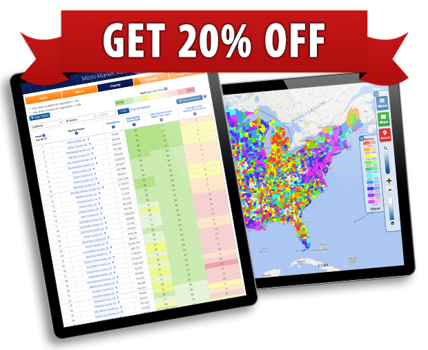
Are the green “Wealth Phase” sections of State & Metro charts also available for Micro Markets?
ANSWER:
Wealth Phase charts do not apply at the zip code (or any micro market) level because a zip code is NOT a market unto itself, it is a sub-market that tends to follow its parent metro market.