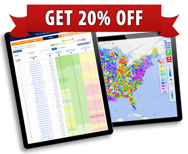
In addition to the actual scores, values or percentages shown in the table below, we also COLOR CODE most cells to show where each score ranks when compared to ALL similar markets we track, NATIONWIDE.
Green colors are used for the strongest/top percentiles, Yellow is for middle ranges and red indicates the weakest or least desirable for that indicator.
The colors correspond to that indicator’s score on a scale of zero % (worst) to 99% (best). For example, a DARK GREEN cell means THAT market ranks in the top 10% of all markets for that indicator.
You can use these Percentile Ranking Colors to quickly evaluate any market, across multiple indicators and time periods; use them to see at a glance how any market ‘stacks up’ against all similar markets nationwide!