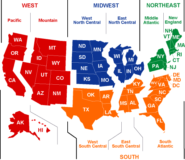
Current Market Conditions Strongest Momentum Regions
Current Market Conditions
Strongest Momentum Regions
Current Market Conditions
TTLCurrent Market Conditions
The charts and indicators on this page represent the most currently available SUMMARY information for the USA and a sampling of select "Strong" and "Weak" States and Regions.
The market analysis tools you see here are known as "Technical Analysis" (or TA) Studies.
There are two ways to analyze any market: by its 'Fundamental' attributes or by its 'Technical' charts.
Until 2006 (when HousingAlerts.com first became publicly available)the data and tools for implementing TA for LOCAL real estate markets simply did not exist.
Before TA (and HousingAlerts.com) real estate investors had to rely on old, outdated and inaccurate Fundamental Analysis (FA) because there was no alternative.
TA is visual, relying on Supply and Demand charts because these charts also track the most important and most elusive driver of future price trends: Market Psychology.
TA has become the dominant methodology for predicting stock, bond, commodity, and currency market cycles worldwide and is used by ALL major investment banks and international trading desks as the underlying basis for TRILLIONS of dollars in DAILY investment transactions.
TTLS.T.A.R. Indicators

The S.T.A.R. momentum indicators show the 'energy' behind any market. For a sustained up-cycle, it MUST be supported by momentum. Market Psychology influences momentum but is not the only driver.
The first step in locating investment candidates is evaluating the S.T.A.R. indicators. Each of the six 'triggers' represent a distinct Technical Analysis (TA) 'event.'.
The left-most columns are Short-Term triggers and carry far less significance than the Long-Term indicators on the right.
However, all Trend Reversals (up or down) BEGIN with the short term triggers. They provide early-warning signals, especially when they develop a consistent pattern of changing colors (from green to red, or red to green) 'growing' from left to right.
Green means positive, upward sloping momentum. Red means the opposite. Yellow occurs when, in the current period, the slope/direction changed for that trigger.
Markets that do not display a consistent color pattern; with seemingly random horizontal color changes from one period to the next, especially in the long-term triggers, are generally lacking ANY momentum, and are poor investment markets for Leveraged Appreciation.
STAR Momentum Indicators
STAR Momentum Indicators
Market Momentum (STAR) Indicators
Strongest Momentum Regions: Middle Atlantic
| Short-Term | Mid-Term | Long-Term | ||||
| #1 | #2 | #3 | #4 | #5 | #6 | |
| Current Qtr | ||||||
| Prior Qtr | ||||||
| 2 Qtrs ago | ||||||
| 3 Qtrs ago | ||||||
| Year ago | ||||||
TTLT.A.P.S. Indicators

The T.A.P.S. (Technical Analysis Point Score) indicator is an easy to understand, graphical way to show the results of complex Technical Analysis (TA) 'Studies.'.
The simple 'slider ball' can move a total of five notches starting from far left (Weak) to far right (Strong).
If the ball position has moved since the prior period, it will have a series of arrows behind it. If the arrows are on the left, that signifies a move from the left, from a weaker to a stronger position, and vice-versa.
Each detailed TA Study has its own slider ball indicator and consists of dozens to hundreds of individual calculations (collectively referred to as 'algorithms').
These detailed algorithms are aggregated and weighted to produce higher level Summary slider indicators until the top-level, overall score is attained.
Technical Analysis Point Score
Technical Analysis Point Score
(TAPS) Indicators
Strongest Momentum Regions: Middle Atlantic

TTLReal Estate Cycle Charts

Charts showing the annual appreciation or decline in real estate values over time are visual snapshots of Supply and Demand forces in action. Technical Analysis (TA) relies on these charts because they accurately reflect what ACTUALLY happened.
The practice of TA consists of what are called "Studies" - different sets of calculations and algorithms proven over time. These Studies include Market Psychologythe most powerful driver of all.
Because real estate is so cyclical (compared to the Stock Marketfor example)relatively simple Studies can be used to accurately track local markets.
Long Term Real Estate Cycles
TTLPercentile Ranking Gauges
These gauges show the exact percentile (rank) of this market relative to all markets. A score of '95%' means that, for this indicator, 95% of ALL markets scored lower. 99% (Green) is the best, 0% (Red) is the worst. Typically, a Master Score in the Green area indicates a hot market.
Exit a market based on declining Master, TAPS and STAR scores, especially when new, emerging markets show much stronger relative strength. Follow the 'Wealth Phase' chart (when it is no longer green) for the 'last' indicator on when to EXIT a market.
Before initiating a NEW investment or entering a NEW market, look for a high (green) Master, TAPS and STAR (momentum) scores combined with a 'green' Wealth Phase chart.
Percentile Ranking Gauges
Current Market Conditions
TTLCurrent Market Conditions
The charts and indicators on this page represent the most currently available SUMMARY information for the USA and a sampling of select "Strong" and "Weak" States and Regions.
The market analysis tools you see here are known as "Technical Analysis" (or TA) Studies.
There are two ways to analyze any market: by its 'Fundamental' attributes or by its 'Technical' charts.
Until 2006 (when HousingAlerts.com first became publicly available)the data and tools for implementing TA for LOCAL real estate markets simply did not exist.
Before TA (and HousingAlerts.com) real estate investors had to rely on old, outdated and inaccurate Fundamental Analysis (FA) because there was no alternative.
TA is visual, relying on Supply and Demand charts because these charts also track the most important and most elusive driver of future price trends: Market Psychology.
TA has become the dominant methodology for predicting stock, bond, commodity, and currency market cycles worldwide and is used by ALL major investment banks and international trading desks as the underlying basis for TRILLIONS of dollars in DAILY investment transactions.
TTLS.T.A.R. Indicators

The S.T.A.R. momentum indicators show the 'energy' behind any market. For a sustained up-cycle, it MUST be supported by momentum. Market Psychology influences momentum but is not the only driver.
The first step in locating investment candidates is evaluating the S.T.A.R. indicators. Each of the six 'triggers' represent a distinct Technical Analysis (TA) 'event.'.
The left-most columns are Short-Term triggers and carry far less significance than the Long-Term indicators on the right.
However, all Trend Reversals (up or down) BEGIN with the short term triggers. They provide early-warning signals, especially when they develop a consistent pattern of changing colors (from green to red, or red to green) 'growing' from left to right.
Green means positive, upward sloping momentum. Red means the opposite. Yellow occurs when, in the current period, the slope/direction changed for that trigger.
Markets that do not display a consistent color pattern; with seemingly random horizontal color changes from one period to the next, especially in the long-term triggers, are generally lacking ANY momentum, and are poor investment markets for Leveraged Appreciation.
STAR Momentum Indicators
STAR Momentum Indicators
Market Momentum (STAR) Indicators
Strongest Momentum Regions: East North Central
| Short-Term | Mid-Term | Long-Term | ||||
| #1 | #2 | #3 | #4 | #5 | #6 | |
| Current Qtr | ||||||
| Prior Qtr | ||||||
| 2 Qtrs ago | ||||||
| 3 Qtrs ago | ||||||
| Year ago | ||||||
TTLT.A.P.S. Indicators

The T.A.P.S. (Technical Analysis Point Score) indicator is an easy to understand, graphical way to show the results of complex Technical Analysis (TA) 'Studies.'.
The simple 'slider ball' can move a total of five notches starting from far left (Weak) to far right (Strong).
If the ball position has moved since the prior period, it will have a series of arrows behind it. If the arrows are on the left, that signifies a move from the left, from a weaker to a stronger position, and vice-versa.
Each detailed TA Study has its own slider ball indicator and consists of dozens to hundreds of individual calculations (collectively referred to as 'algorithms').
These detailed algorithms are aggregated and weighted to produce higher level Summary slider indicators until the top-level, overall score is attained.
Technical Analysis Point Score
Technical Analysis Point Score
(TAPS) Indicators
Strongest Momentum Regions: East North Central

TTLReal Estate Cycle Charts

Charts showing the annual appreciation or decline in real estate values over time are visual snapshots of Supply and Demand forces in action. Technical Analysis (TA) relies on these charts because they accurately reflect what ACTUALLY happened.
The practice of TA consists of what are called "Studies" - different sets of calculations and algorithms proven over time. These Studies include Market Psychologythe most powerful driver of all.
Because real estate is so cyclical (compared to the Stock Marketfor example)relatively simple Studies can be used to accurately track local markets.
Long Term Real Estate Cycles
TTLPercentile Ranking Gauges
These gauges show the exact percentile (rank) of this market relative to all markets. A score of '95%' means that, for this indicator, 95% of ALL markets scored lower. 99% (Green) is the best, 0% (Red) is the worst. Typically, a Master Score in the Green area indicates a hot market.
Exit a market based on declining Master, TAPS and STAR scores, especially when new, emerging markets show much stronger relative strength. Follow the 'Wealth Phase' chart (when it is no longer green) for the 'last' indicator on when to EXIT a market.
Before initiating a NEW investment or entering a NEW market, look for a high (green) Master, TAPS and STAR (momentum) scores combined with a 'green' Wealth Phase chart.
Percentile Ranking Gauges
Current Market Conditions
TTLCurrent Market Conditions
The charts and indicators on this page represent the most currently available SUMMARY information for the USA and a sampling of select "Strong" and "Weak" States and Regions.
The market analysis tools you see here are known as "Technical Analysis" (or TA) Studies.
There are two ways to analyze any market: by its 'Fundamental' attributes or by its 'Technical' charts.
Until 2006 (when HousingAlerts.com first became publicly available)the data and tools for implementing TA for LOCAL real estate markets simply did not exist.
Before TA (and HousingAlerts.com) real estate investors had to rely on old, outdated and inaccurate Fundamental Analysis (FA) because there was no alternative.
TA is visual, relying on Supply and Demand charts because these charts also track the most important and most elusive driver of future price trends: Market Psychology.
TA has become the dominant methodology for predicting stock, bond, commodity, and currency market cycles worldwide and is used by ALL major investment banks and international trading desks as the underlying basis for TRILLIONS of dollars in DAILY investment transactions.
TTLS.T.A.R. Indicators

The S.T.A.R. momentum indicators show the 'energy' behind any market. For a sustained up-cycle, it MUST be supported by momentum. Market Psychology influences momentum but is not the only driver.
The first step in locating investment candidates is evaluating the S.T.A.R. indicators. Each of the six 'triggers' represent a distinct Technical Analysis (TA) 'event.'.
The left-most columns are Short-Term triggers and carry far less significance than the Long-Term indicators on the right.
However, all Trend Reversals (up or down) BEGIN with the short term triggers. They provide early-warning signals, especially when they develop a consistent pattern of changing colors (from green to red, or red to green) 'growing' from left to right.
Green means positive, upward sloping momentum. Red means the opposite. Yellow occurs when, in the current period, the slope/direction changed for that trigger.
Markets that do not display a consistent color pattern; with seemingly random horizontal color changes from one period to the next, especially in the long-term triggers, are generally lacking ANY momentum, and are poor investment markets for Leveraged Appreciation.
STAR Momentum Indicators
STAR Momentum Indicators
Market Momentum (STAR) Indicators
Strongest Momentum Regions: New England
| Short-Term | Mid-Term | Long-Term | ||||
| #1 | #2 | #3 | #4 | #5 | #6 | |
| Current Qtr | ||||||
| Prior Qtr | ||||||
| 2 Qtrs ago | ||||||
| 3 Qtrs ago | ||||||
| Year ago | ||||||
TTLT.A.P.S. Indicators

The T.A.P.S. (Technical Analysis Point Score) indicator is an easy to understand, graphical way to show the results of complex Technical Analysis (TA) 'Studies.'.
The simple 'slider ball' can move a total of five notches starting from far left (Weak) to far right (Strong).
If the ball position has moved since the prior period, it will have a series of arrows behind it. If the arrows are on the left, that signifies a move from the left, from a weaker to a stronger position, and vice-versa.
Each detailed TA Study has its own slider ball indicator and consists of dozens to hundreds of individual calculations (collectively referred to as 'algorithms').
These detailed algorithms are aggregated and weighted to produce higher level Summary slider indicators until the top-level, overall score is attained.
Technical Analysis Point Score
Technical Analysis Point Score
(TAPS) Indicators
Strongest Momentum Regions: New England

TTLReal Estate Cycle Charts

Charts showing the annual appreciation or decline in real estate values over time are visual snapshots of Supply and Demand forces in action. Technical Analysis (TA) relies on these charts because they accurately reflect what ACTUALLY happened.
The practice of TA consists of what are called "Studies" - different sets of calculations and algorithms proven over time. These Studies include Market Psychologythe most powerful driver of all.
Because real estate is so cyclical (compared to the Stock Marketfor example)relatively simple Studies can be used to accurately track local markets.
Long Term Real Estate Cycles
TTLPercentile Ranking Gauges
These gauges show the exact percentile (rank) of this market relative to all markets. A score of '95%' means that, for this indicator, 95% of ALL markets scored lower. 99% (Green) is the best, 0% (Red) is the worst. Typically, a Master Score in the Green area indicates a hot market.
Exit a market based on declining Master, TAPS and STAR scores, especially when new, emerging markets show much stronger relative strength. Follow the 'Wealth Phase' chart (when it is no longer green) for the 'last' indicator on when to EXIT a market.
Before initiating a NEW investment or entering a NEW market, look for a high (green) Master, TAPS and STAR (momentum) scores combined with a 'green' Wealth Phase chart.
Percentile Ranking Gauges
Current Market Conditions
TTLCurrent Market Conditions
The charts and indicators on this page represent the most currently available SUMMARY information for the USA and a sampling of select "Strong" and "Weak" States and Regions.
The market analysis tools you see here are known as "Technical Analysis" (or TA) Studies.
There are two ways to analyze any market: by its 'Fundamental' attributes or by its 'Technical' charts.
Until 2006 (when HousingAlerts.com first became publicly available)the data and tools for implementing TA for LOCAL real estate markets simply did not exist.
Before TA (and HousingAlerts.com) real estate investors had to rely on old, outdated and inaccurate Fundamental Analysis (FA) because there was no alternative.
TA is visual, relying on Supply and Demand charts because these charts also track the most important and most elusive driver of future price trends: Market Psychology.
TA has become the dominant methodology for predicting stock, bond, commodity, and currency market cycles worldwide and is used by ALL major investment banks and international trading desks as the underlying basis for TRILLIONS of dollars in DAILY investment transactions.
TTLS.T.A.R. Indicators

The S.T.A.R. momentum indicators show the 'energy' behind any market. For a sustained up-cycle, it MUST be supported by momentum. Market Psychology influences momentum but is not the only driver.
The first step in locating investment candidates is evaluating the S.T.A.R. indicators. Each of the six 'triggers' represent a distinct Technical Analysis (TA) 'event.'.
The left-most columns are Short-Term triggers and carry far less significance than the Long-Term indicators on the right.
However, all Trend Reversals (up or down) BEGIN with the short term triggers. They provide early-warning signals, especially when they develop a consistent pattern of changing colors (from green to red, or red to green) 'growing' from left to right.
Green means positive, upward sloping momentum. Red means the opposite. Yellow occurs when, in the current period, the slope/direction changed for that trigger.
Markets that do not display a consistent color pattern; with seemingly random horizontal color changes from one period to the next, especially in the long-term triggers, are generally lacking ANY momentum, and are poor investment markets for Leveraged Appreciation.
STAR Momentum Indicators
STAR Momentum Indicators
Market Momentum (STAR) Indicators
Strongest Momentum Regions: Pacific
| Short-Term | Mid-Term | Long-Term | ||||
| #1 | #2 | #3 | #4 | #5 | #6 | |
| Current Qtr | ||||||
| Prior Qtr | ||||||
| 2 Qtrs ago | ||||||
| 3 Qtrs ago | ||||||
| Year ago | ||||||
TTLT.A.P.S. Indicators

The T.A.P.S. (Technical Analysis Point Score) indicator is an easy to understand, graphical way to show the results of complex Technical Analysis (TA) 'Studies.'.
The simple 'slider ball' can move a total of five notches starting from far left (Weak) to far right (Strong).
If the ball position has moved since the prior period, it will have a series of arrows behind it. If the arrows are on the left, that signifies a move from the left, from a weaker to a stronger position, and vice-versa.
Each detailed TA Study has its own slider ball indicator and consists of dozens to hundreds of individual calculations (collectively referred to as 'algorithms').
These detailed algorithms are aggregated and weighted to produce higher level Summary slider indicators until the top-level, overall score is attained.
Technical Analysis Point Score
Technical Analysis Point Score
(TAPS) Indicators
Strongest Momentum Regions: Pacific

TTLReal Estate Cycle Charts

Charts showing the annual appreciation or decline in real estate values over time are visual snapshots of Supply and Demand forces in action. Technical Analysis (TA) relies on these charts because they accurately reflect what ACTUALLY happened.
The practice of TA consists of what are called "Studies" - different sets of calculations and algorithms proven over time. These Studies include Market Psychologythe most powerful driver of all.
Because real estate is so cyclical (compared to the Stock Marketfor example)relatively simple Studies can be used to accurately track local markets.
Long Term Real Estate Cycles
TTLPercentile Ranking Gauges
These gauges show the exact percentile (rank) of this market relative to all markets. A score of '95%' means that, for this indicator, 95% of ALL markets scored lower. 99% (Green) is the best, 0% (Red) is the worst. Typically, a Master Score in the Green area indicates a hot market.
Exit a market based on declining Master, TAPS and STAR scores, especially when new, emerging markets show much stronger relative strength. Follow the 'Wealth Phase' chart (when it is no longer green) for the 'last' indicator on when to EXIT a market.
Before initiating a NEW investment or entering a NEW market, look for a high (green) Master, TAPS and STAR (momentum) scores combined with a 'green' Wealth Phase chart.
Percentile Ranking Gauges
USA Regional Map
