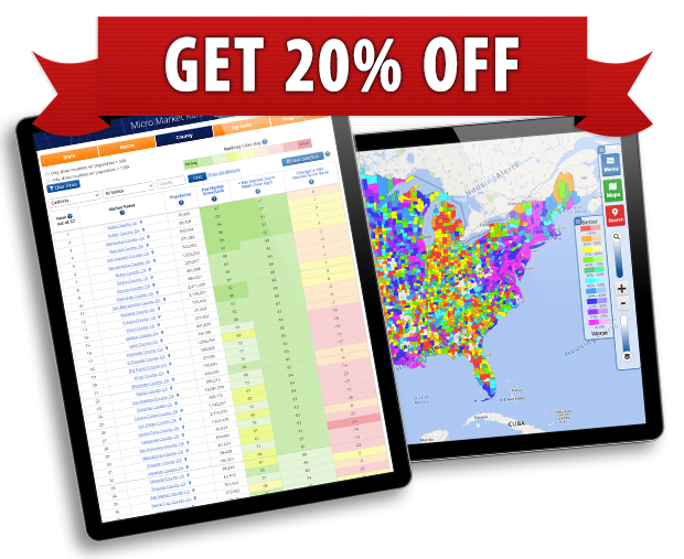
Our data TABLES and GAUGES use a simplified ‘traffic light’ color scheme of green, yellow, or red whereas our MAPS use all 10 colors on the color wheel (from red to blue to pink and purple) which makes it easier to see the different levels of hot/cold or strong/weak on the maps.
The map colors are roughly in-line with the comparison charts below...
Map
Legend
Legend
STRONG
WEAK
Finder Tables
STRONG
WEAK
Gauge
Rank
Rank
STRONG
WEAK
Gauge
RAW
RAW
STRONG
WEAK
STAR Circles
STRONG
WEAK